The theme for this magazine is fashion and style, and the title is “Fashion Forward”. It covers stories on the latest style trends, fashion advice, and various analyses on the future of style. These stories appeal to young adults because many are concerned about being stylish and looking good. This magazine allows them to know what to wear and when to wear it, as well as what is and isn’t in style.
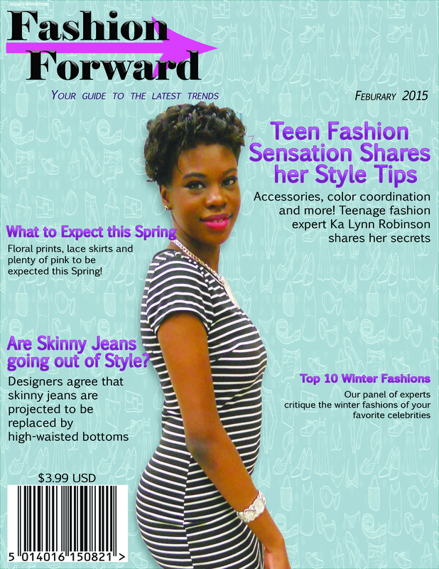
The image for the background is a fashionable teen posing in one of her favorite outfits. It’s a suitable image because the subject of the image is an aspiring fashion designer who is also featured in one of the cover lines. She is also a fashion-forward teenager, so the image applies to the magazine’s subject and desired audience. The image is edited to make the subject stand out by increasing the brightness and altering the curves and levels to make it bolder.
The fonts used in the magazine are Elephant, for the masthead, and Euphemia, a simple, sans-serif font, for the other text. The style of type in the masthead is serif, and is bigger and bolder than the type in the cover lines. The text in the cover was beveled in order to make it stand out more, and strokes were applied to the cover lines in order to make them bolder and more visible. Paragraph styles were used to adjust the alignment of the text to make it better suited for the side of the cover that it was on. The placement of the text was determined by guides set prior to beginning work on the project. In order to make the magazine more appealing, a flashier, sharper background image would be used to make it more attention-grabbing.

 RSS Feed
