There are many important factors to take into consideration when designing a logo. One of them is that a logo should be limited to three colors to prevent it from looking too busy or colorful. Also, the colors that are chosen are meant to evoke certain feelings in those who see the logo. Logos have to be able to look good at any size, on any surface. This ensures that the logo can be seen clearly and perfectly at all times, which helps it serve its purpose in representing the company. All three of these elements are also important in aesthetic appeal and representing the owner of the logo.
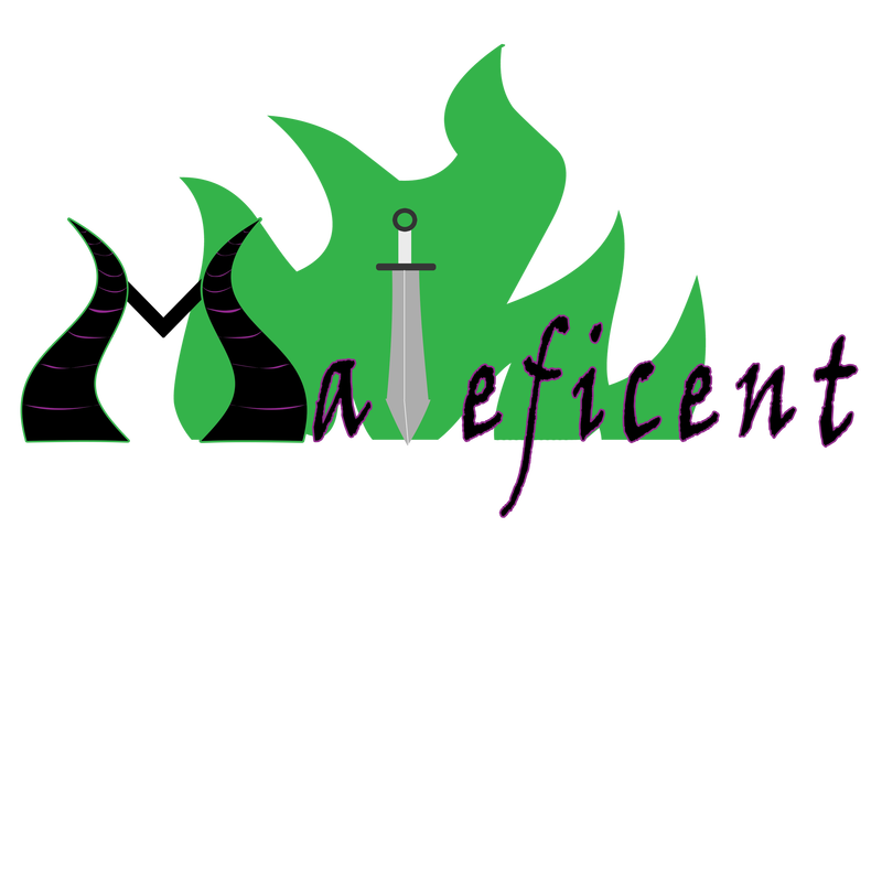
The villain that I chose for this project was Maleficent. Not because she was played by Angelina Jolie in the recent movie, but because she’s been my favorite Disney villain since I could read; she was intelligent, calculating, and, most importantly, could turn into a dragon and wasn’t afraid to get things done herself. Two of Maleficent’s major characteristics are her curved horns and the green fire that she breathes as a dragon, both of which I included in the logo. Her death (stupid princes and fairies) was caused by being struck with an enchanted sword, so I turned the ‘l’ in her name into a sword.
To create my logo, I used triangles, lines, rectangles, and ellipses. I used the warp tool to turn the triangles into curved horns, then warped lines to make curved markings and used rectangles for the connecting lines. The sword is a rectangle combined with a rectangle, then warped to be thinner near the handle, which was also made with rectangles. The gem on the end of the handle is an ellipse with a stroke around it. I chose to use the colors purple, black, and green. Purple and black are the main colors that Maleficent wears, so they represent her well. The fire that she uses is a bright green. I used type in the logo to reflect her general cruel nature, and downloaded a fire font to create the background. The three most helpful tools were the warp tool, polygon tool, and the guides. The warp tool allowed me to make clean curves and angles, such as in the horns, the markings in the horns, and the sword. The polygon tool ensured that all of the shapes would have smooth edges, which was useful when it came to the horns and sword. Using the guides, I could make sure than my logo was symmetrical and everything was precisely measured. If I were to begin this logo design again, I would focus on making the sword more attractive, possibly by using a layer style to make it pop out more.

 RSS Feed
