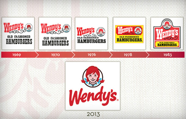
I chose the logo for Wendy’s because it’s one of my favorite fast food restaurants and it’s current logo is very different from the original. The mascot of a young girl with red pigtails has been a constant factor in the logo and is one of the most interesting visual qualities to me because of it. I also find the font and color scheme to be appealing. The logo was first used in 1969 to promote the “old fashioned” hamburgers. The current logo is much simpler and more modern than its former logos. The older logos used a font that seemed more rustic or Western, while the current font is more similar to handwriting. The new logo also removes the extraneous text or details, removing the background and “old fashioned hamburgers”, possibly because the menu has more variety. The girl featured in the logo is also drawn with more detail, and looks much better. If I were to redesign the logo, I would incorporate something that promotes the variety in the menu. This way, people can see that the restaurant offers something for just about everyone.

 RSS Feed
